-
Corporate Interior to Core Asset
April 2012
By Benjamin Fowler | Photography Lilantha Wijayapala
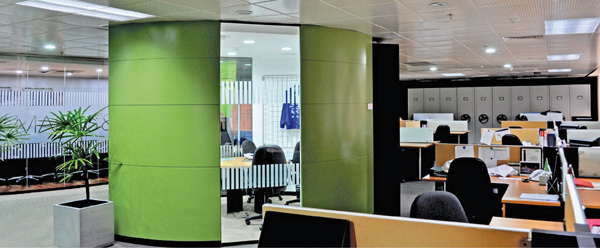
“They wanted a very chic sort of interior but of course on a controlled budget, as this was two years ago when the economy was just recovering,” said Archt Lilantha Wijayapala, explaining the starting point for the design of a corporate interior for a UK-based apparel office in Colombo. The client’s desire for a low energy office space also complicated matters, considering the budget and the limitations found in any refurbishment. Given the limitations, creativity prevailed.
The most striking feature of the single-storey interior is the “core” layout which, as far as most office spaces are concerned, is a total inversion because typically the top management and the main boardroom are located at the edge of the office affording the best views. “We have located these areas in the core – the centre, and placed the rest of the office in an open office concept around it,” he explained. The core arrangement also makes it easier to expand even one particular department. You have no boundaries and it is just a matter of moving back and forth, around this core.
The building gets plenty of daylight and could also get uncomfortably hot on account of the East and West facials, so the Architect has opted for laminated, heat-proof glass in place of curtains, so as to maximise sunlight while also keeping the interior cool. This contributes to the client’s desire for a green office.
The ceiling is made of perforated steel panels giving the interior a modern sheen. As the panels are more reflective compared to a plaster ceiling it complements the office’s many glass partitions to help refract the natural daylight deeper towards the core. They also pick up the lime hues of the vibrantly painted walls, helping circulate the zesty colour throughout the office. Additionally, these fire-rated metal panels allow for greater flexibility, even with more intensive office renovations.
“We couldn’t allocate that many storage rooms, so we made storage a feature of the interior”
In keeping with a workplace designed to be flexible and fluid, the desks are made of thin yet stable wood, and demarcated by glass partitions. The metal boards, where the occupant can stick memos to photos or whatever else with a magnet, contributes towards an active and lively workstation.”
The office’s 7,200sqft of real estate presented some issues. Aside from the standard office fare, the client, being in the clothing industry, needed space within for thousands of garments. “We couldn’t allocate that many storage rooms, so we made storage a feature of the interior by using wall spaces as cupboards. Wherever possible, we made the partitions thicker and made it a cupboard.” The architect also utilised the technology of compact storage, in which modular storage units can be moved along lateral rails. Though you can only access one aisle at a time, the mobility coupled with the compressed space makes for highly efficient storage in a small space. According to the Archt, this method can increase filling space volume by 300 percent.
The concepts on open office designs are still evolving, giving much prominence to cost and efficiency. It’s not just about getting everyone out of cubicles. “However, as architects, we must make sure that there is a humane side to whatever concept one adopts. An office worker normally spend around eight hours a day in office, so we have to make sure the work environment is warm enough and homely enough, so when we use colours, textures, materials, we make sure that we do not create just a dedicated work station,” were the concluding remarks of Archt.Lilantha Wijayapala.
Architectural Firm: Design Forum
Project Archt: Lilantha Wijayapala
Client: Marks & Spencer
Square Area of Site: 7200 sqft
Date of Completion: July 2010
Contractor (Interior): Westgate International
Contractor (Electrical): Fentons